data.ai
data.ai (formerly App Annie and now Sensor Tower) was the global leader in consumer and market insights, empowering the world’s top brands with analytics that drive competitive advantage across all digital channels. Their intelligence platform enables businesses to develop, grow, and optimize their digital strategies. The goal of this project was to elevate the brand’s visual identity to feel more enterprise, bold, and premium—while increasing engagement across marketing touchpoints.
Using “the gem” as a conceptual and visual anchor, I drew inspiration from the brand’s evolving messaging, which incorporated language based on the four Cs of diamonds—cut, clarity, carat, and color. Phrases like “data.ai provides the clarity you need” and “a cut above” shaped the creative direction.
team
Michaela Jacobsberg-Reiss | Head of Product Marketing & Content
Beth Ann-Smith | Sr Director of Brand & Product Marketing
Libby Cohen | Content Writer
Sean Patel | Lead Graphic Designer
Freesia Algar | Director of Events
Patrick Larkin Senior Video Producer
service
brand
web
social

Social
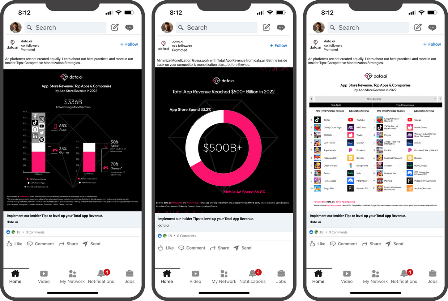
To boost engagement and traffic on data.ai’s social timeline, I updated the social content to align with the newly refreshed brand. During the audit of previous social posts, it became clear that irrelevant imagery and unclear messaging were hindering effectiveness and obscuring data.
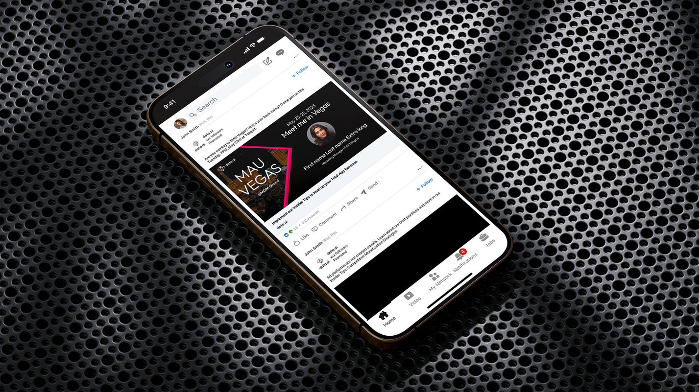
Building on insights from our audit, I focused on creating visually impactful posts that stood out in crowded timelines. This was achieved by using large H1 typography, high-contrast design, and bold color accents—ensuring that the messaging was both clear and attention-grabbing.

Presentation template
For the sales team we created an all new presentation template. The main request from sales was that the new template be data friendly, clean and uncluttered. The prism was added as a textural element to add depth to title and quote slides, as well as a light and dark option of all slides.


MAU Vegas
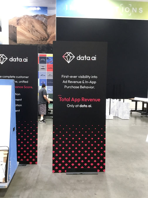
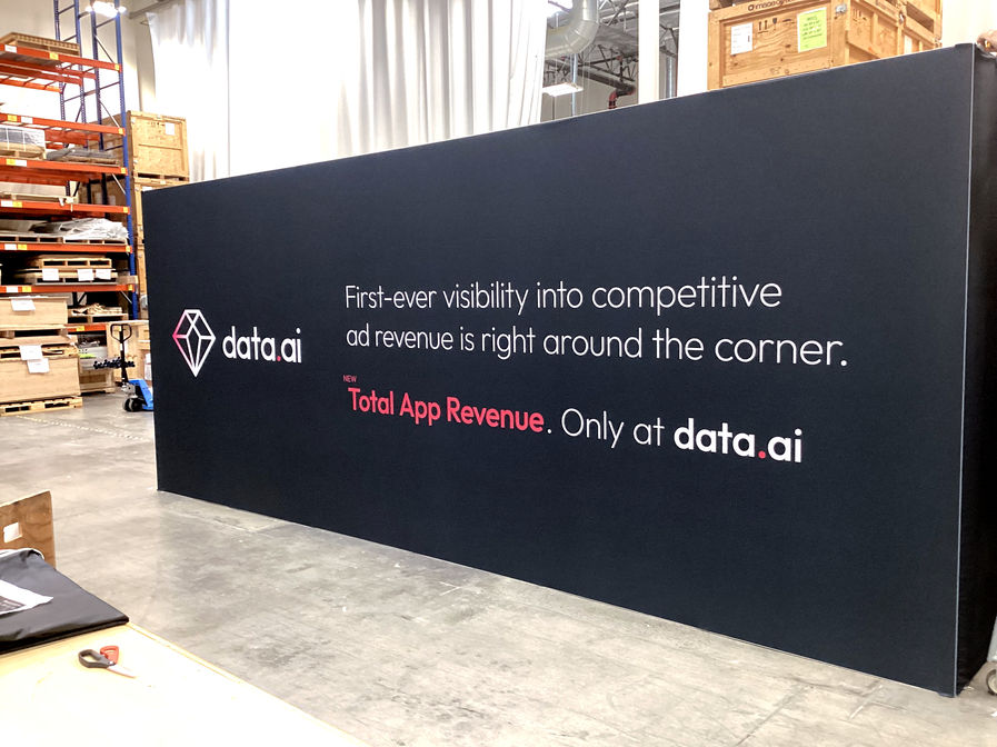
To support the launch of data.ai’s newest product, I designed an immersive event booth and supporting social campaign for MAU Vegas. The goal was to create a bold, branded space for sales and messaging, while driving engagement before and during the event.
All initial design explorations were developed in black and white to focus on layout and structure—ensuring clear stakeholder alignment before color was applied. Working closely with Director of Events Freesia Algar, we crafted a space that became one of data.ai’s most successful event activations.
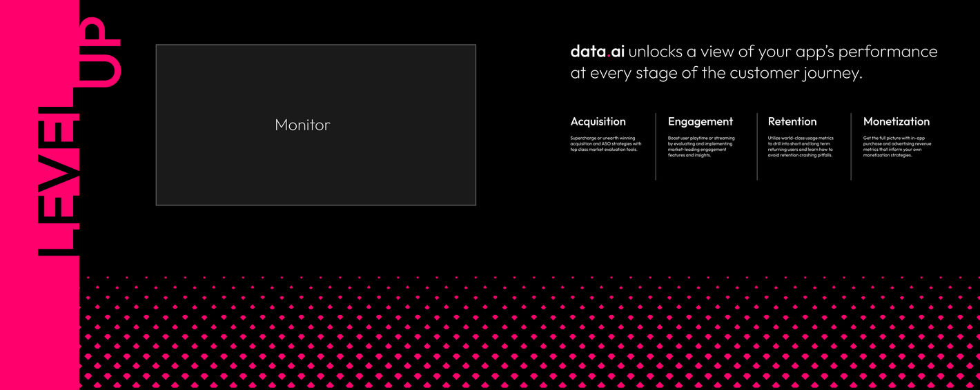
I transformed the diamond logo into a repeatable gradient pattern that led viewers’ eyes upward toward messaging and screens. The back wall featured the customer journey as a demo backdrop, while additional signage and product placement extended the brand throughout the space.


