Subnivean
Subnivean, a literary journal housed at SUNY Oswego—where the city receives four times more snow than Manhattan—publishes three curated issues per year. Managed by a team of driven undergraduate editors, the journal delivers "high-caliber literary content amidst the digital noise ...". The ask was to create a unique brand and website experience that would resonate with literary audiences, students, and faculty.
I focused on typography as the foundation of the brand system, with hierarchy and spacing designed to support long-form reading without distraction. The wordmark is conceptually tied to the idea of "what exists beneath the surface", reinforcing the journal’s identity.
2021 Firecracker Award
Nominee for Best Literary Journal Debut
service
brand
web
marketing

Texture & depth
Departing from the common white-background aesthetic of most literary sites, the client and I discussed creating some kind of visual element to the page that wouldn't hamper readability. We settled on urban abstract photography converted to grayscale to provide the texture, depth, and visual richness of the work presented in each issue.
Instead of compact menus and carousels we collectively opted for a long scroll to slowly introduce users to content. Readers have said that it feels like a "...3rd space" where they "... spend time and not feel rushed ... like reading from the shelves in a nice bookstore.


Anthology
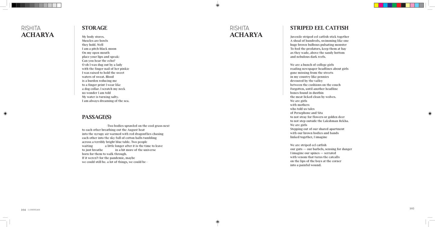
To celebrate their 5 year anniversary Subnivean created a "best of" anthology to spotlight Subnivean Award winners and works from notable and emerging authors, such as Arisa White, Juan Felipe-Herrera, Paul Flores, to name a few.
In order to earn our place on reader's coffee tables the editor selected a square shape, to be unique and stand out. This shape produced several unique challenges. Greatest of all was designing for "Visual" poems. Visual poems cannot be change in any way; a change to a line break or a space breaks the poem and can change it's meaning. Using Chaun Ballard's award winning poem, I found that a "pin-up" layout was the best way forward to showcase his and the other artists' brilliant work.


